Redesigning the experience
Developing the UX design for the Catho Empresas website was an exciting and transformative challenge. From the start, we understood that the project required more than a visually appealing interface; it was essential to rethink the digital experience for a demanding audience seeking efficiency, clarity, and agility. The first step was a deep immersion in research, conducting interviews with Human Resources professionals, mapping journeys, and identifying key friction points in the current flow. These insights revealed behaviors and expectations that guided our design decisions.
With the gathered insights, we structured the project based on the Double Diamond methodology, ensuring a clear separation between the discovery, definition, ideation, and delivery phases. During the ideation phase, we collaborated closely with stakeholders from various areas — product, development, marketing, and customer service — to create solutions aligned with both business objectives and user needs. Co-creation was essential to quickly validate hypotheses and ensure alignment among teams. We prototyped different flows in Figma and conducted usability tests, refining navigation paths and simplifying the process of searching for and hiring talent.
Challenge
Understanding recruiters’ needs and transforming complex workflows into simple and efficient experiences.
Research Interviews User Flow UI Design Prototype
UX in the recruiters journey
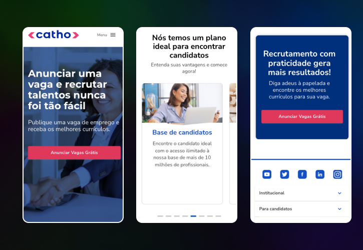
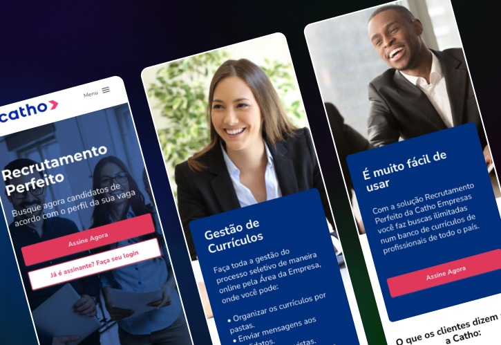
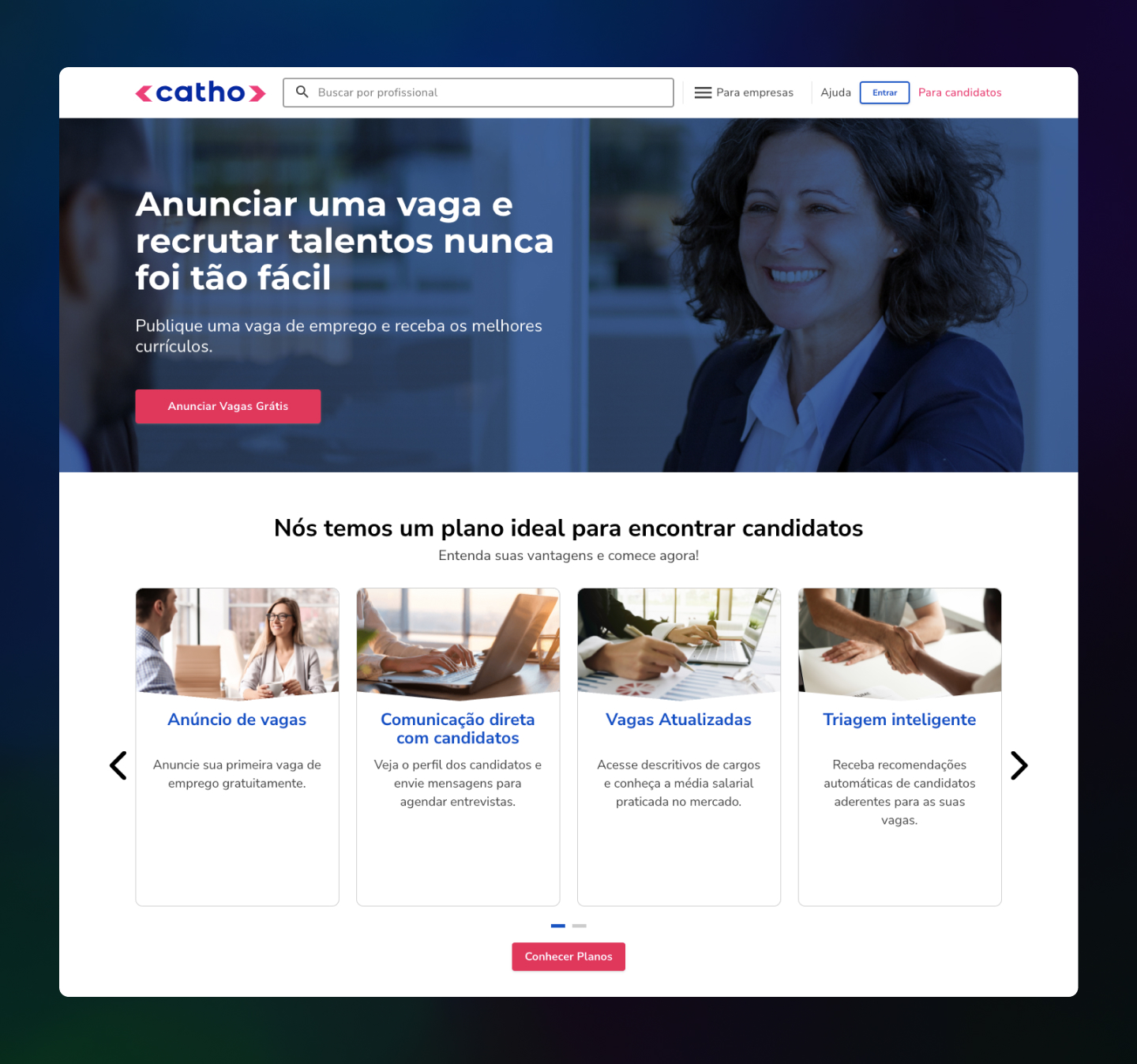
One of the project’s major achievements was making navigation more intuitive and reducing the time recruiters spent finding and filtering candidates. We implemented a clean interface with smart filters and a visual feedback system that guided users smoothly through the process. The site was also optimized for different devices, ensuring a consistent experience across desktop, tablet, and mobile. These improvements were quickly noticed, resulting in increased engagement and reduced drop-off rates during critical stages.
By the end of the project, we delivered not just a refreshed interface, but a solid, user-centered experience aligned with Catho Empresas’ value proposition. The work was recognized internally for its active listening, empathy toward the target audience, and delivery of tangible results. It was a journey of continuous learning, where design once again proved to be the bridge between technology and people, reaffirming its power to transform realities.